News
Interview with Leni Schwendinger
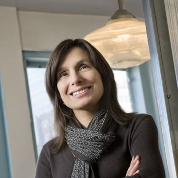
 Image credit: Kit Noble
Recently, you've been giving guided evening tours of the light scapes of major cities. What are examples of well lit and poorly lit cities? What are some of the key things people seem to take away from these tours? What surprises people about the impact of good and bad urban lighting design?
I just did a light walk in Washington, D.C. In retrospect, I thought the lighting of the city was adequate but it wasn’t at all interesting. What we’re trying to understand better is who owns the lighting, who is responsible for the nighttime environment. Basically, it's city agencies, sometimes utilities. The lighting system that we rely on and takes care of us at night is street lighting. It’s focused on the streets, but what about the sidewalks? What we learn from sidewalk lighting is that most is from storefront and private lighting -- display windows and sconces on buildings and all the kinds of building-mounted lights that contribute to the sidewalk. That's all very commercial.
The next layer, however, is quite unexpected. That is the layer that I call "found lighting." Found lighting gives us animation, color, and surprise. The blinking lights of the ATM, Christmas lights, and billboards are contributing light but they weren’t really meant to light the sidewalks and the streets where we’re standing. It’s important to take a look at the textures of the night and light at night. Where does that come from and who owns it and who designs it?
People on the tours have begun to talk about them as a kind of treasure hunt. There’s a sense of adventure and sort of eye opening that happens on the tours. It’s important that people see a place where they’ve always been walking around at night and yet see it with new eyes. It's an inspiring and enlivening relationship with the city that I’m happy to promote.
You’re a part of the Snohetta-led design team that will transform Times Square into a permanent pedestrian plaza. You told The Architect's Newspaper that it’s an opportunity to “redefine the role of light in the public space of Times Square for pedestrians.” How do you see lighting as an opportunity to change the way people use Times Square, a place that gets upwards of 350,000 visitors every day?
I’ll restate my statement: we hope to redefine the role of light in the public space of Times Square for pedestrians. Times Square and the Great White Way, which is more Broadway and the theaters of Times Square, has a reputation for strolling. From the beginning of Times Square, there has been a legacy of social space and advertising. So, the rationale for Times Square has been continuous, but it's also gotten overly-crowded. The differing objectives of cars and pedestrians has become rather adversarial. People want to stroll, look at windows, take their time, and take photographs. The impact of taking photographs in our larger American plazas is just extraordinary. People stand still and take photographs. You see so many cameras in the air. People hold them up and take pictures. That’s a whole new activity.
Lighting has been mandated in Times Square. We have a minimum foot candle requirement. This is written as a regulatory guideline. It’s quite unusual -- cities usually have maximum foot candle levels. We want pedestrians to stay and hang out, have fun. I hope that lighting will change from its role of entertaining and selling to enabling more down the earth activities we have yet to define. What kind of games can we play with light? What kinds of conversation areas can we create simply by defining boundaries with light?
In another New York City project, you transformed the vehicular and pedestrian experience in Manhattan’s Port Authority Bus Terminal, a pretty dreadful place for commuters, with a powerfully engaging lighting design. How have pedestrians responded to the new design? Has the terminal tracked the changes in traffic to see if the new approach has been successful?
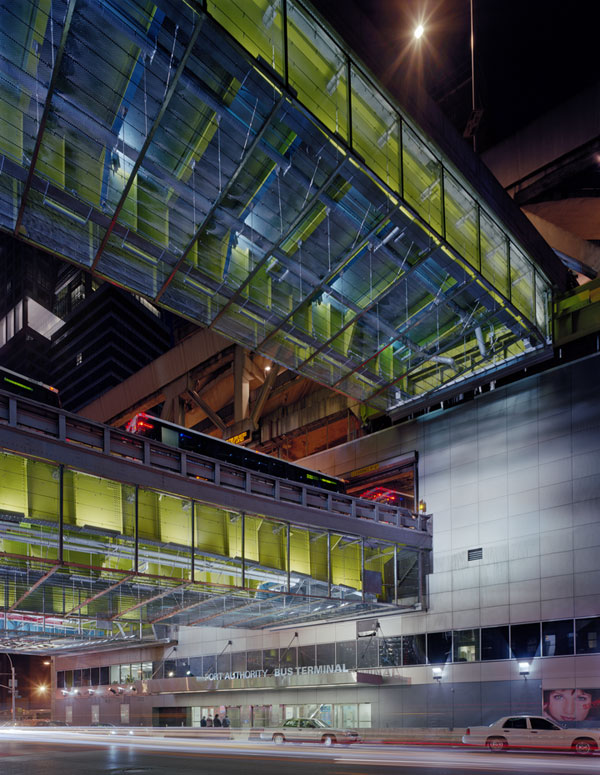
The Triple Bridge Gateway started with a really smart infrastructural funding model. I always like to mention this because I think it was so successful. There was a paving and snow melting system improvement planned. Port Authority asked the Community Board there what they’d like to do aesthetically because this area under the bus ramps was so dreadful, dark, and scary -- really a divider between these two neighborhoods. So they folded an aesthetic improvement into the infrastructure budget and it was brilliantly conceived in that manner. We were responsible for the color palette and the lighting. For those who’ve seen the images, the lighting is all white light and the color palette is paint infused with white light. It becomes a kind of of surface of light. We’ve really turned the bus ramps, which were so foreboding, into a canvas of color.
 Port Authority Bus Terminal, New York City. Image credit: Archphoto
Now the question about how have pedestrians responded and whether the approach been successful is really good. When a very experimental, innovative, and unexpected project approaches, you would hope that the agencies and owners would do a kind of post-completion phase, a survey of some sort. We do so many projects where we would love to have some kind of survey afterwards, but everyone involved is pretty exhausted by the end. This one took eight years to construct, and, so far, we haven’t had an opportunity to go out and do a survey and get feedback.
I can only tell you anecdotally about feedback. I led a tour around the area and I can tell you how they responded. There were architects, engineers, and administrators and they were just enthralled and excited to get a close-up look. It was interesting to see who had noticed the new Triple Bridge and who hadn’t. It’s amazing how people can cast a blind eye on a piece of infrastructure. A lot of people had never seen it before even though it’s right in Midtown Manhattan. It's on the edge of the city but it’s pretty accessible. It's on the way to Times Square. They all thought that it was really made for pedestrians, which is true. It's really designed to help the pedestrian crossing from one neighborhood to the other via the largest bus terminal in the U.S. To your point, though, it would be great to have these kind of design projects taken seriously at the level of a pre- and post-survey to see what people’s responses are but as of yet that doesn’t happen.
For HtO, a new park in Toronto created out of a waterfront brownfield, you used lighting design to create a place people feel they can visit late into the evening. The parks dunes are lit and underwater illumination creates the sense that the park is floating. How did you work with the park's landscape architects, Claude Cormier and Janet Rosenberg, to make the park both exciting and accessible at night? How did you use lighting to tell the story of a sustainable urban redevelopment, transforming a brownfield into a vital urban space?
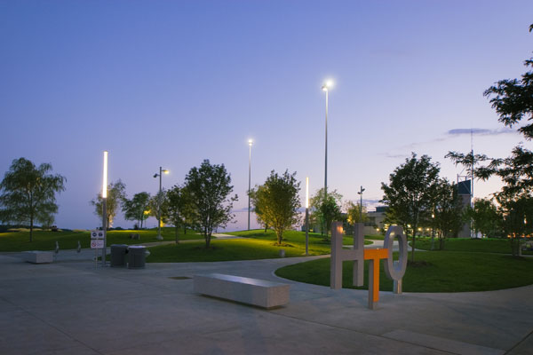
HtO has really worked out beautifully. It was fantastic working with two very good landscape architects. I think Claude took on the conceptual design role and Janet worked on executing the project. It was collaborative and fun. The idea of lighting the dunes as a kind of dramatic space was something that we came up with to enhance the topography of the park. In part, that’s why we have these colorful dunes. We also did something that was pretty daring -- we used high-mast lighting, which is something that’s gaining more and more acceptability although it’s hard to sell to communities. High-mast lighting systems are typically 120 feet tall. You have a number of lights on it. The reason it's useful is that you don’t have lots and lots lighting poles.
The high-mast lighting poles for the dunes create a threshold of light, a carpet of light, that gives us the base safety layer. We’re using them in Dallas and some other places, too. In Staten Island, we are using to reduce the number of penetrations into the ground and blockages of circulation. The less poles the better as far as I’m concerned, but then you also have a tradeoff in having something a bit over-sized and over-scaled. It takes a while to get the right scale and convince people. Early on in public lighting history, there were moonlight poles. In Austin, they use super-high moonlight poles and just use a few lights to cover a large area. I think it’s a good approach to save energy and keep technology out of the way of park users.
 Ht0 Park, Toronto, Canada. Image credit: Archphoto
For Seattle Center’s McCaw Hall Kreilsheimer Promenade, you worked with Gustafson Guthrie Nichol to create illuminated metal mesh scrims that define and echo the entry architecture. The light public artwork called "Dreaming in Color" turns the scrims into canvases for an orchestrated light performance. How did you conceive of the piece? What design elements in the landscape or elsewhere in the site inspired you?
The McCaw Hall project was really a delight. I was called by a Public Art Commission in Seattle to apply to be a technical advisor. So we started already with a hybrid -- calling an artist to be a technical advisor. The mandate was to advise LMN Architects on an idea they had, which was several vertical layers of mesh or perforated metal that would receive video projections. We did a feasibility study for this idea and everyone on the design team as well as the owner agreed that video wasn’t the best idea. They said, "Leni, we’d like to give a commission to create an artwork here." That was great because we’d done so much research into the physical layout of these scrims and the passageway that connects a Seattle public street with the Seattle Center, this great landscape, fountain, and cultural space.
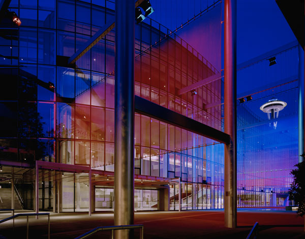
However, we knew there were a lot difficulties, especially around budget and maintenance. So we wanted to do some kind of a color project, because, budget-wise, we couldn’t do things that were very complex. I came back to the studio after some brainstorming and said “if only we could just use one light, just one perfect light for this project." I often approach my projects that way: what is the one light we could use? Obviously, one light is the sun and the other is the moon but with electrical light, you generally have to use more than one light. We found a panoramic light that would cover a lot of area and ended up using two lights per scrim. Each scrim is about 30 feet by 50 feet. They’re made of Cascade Coil Drapery, a woven metal mesh.
It really was a true collaboration -- the design team included architects, landscape architects, scenic designer (an opera designer who would work at the McCaw Hall), engineers, stakeholders, and owners. We all worked together and did presentations to each other in a brainstorming style. It was an exciting kind of mind meld. The owner wanted to bring a sense of theatricality outdoors for all Seattle Center visitors, whether they were going to the opera or the ballet or not. One of my objectives is to make the meaning of the buildings and spaces understandable to the public. "Dreaming in Color" is really a stage set in a sense, but it’s immersive. The viewer and the visitor is immersed by color. In another sense, it’s a three dimensional color filled painting that the viewer walks within.
 Seattle Center’s McCaw Hall Kreilsheimer Promenade. Image credit: Archphoto
There’s been lots of discussion about how cities and communities can incentivize the use of public transit by integrating transit stations into communities. This involves creating walkable, bikeable transportation networks that can easily interconnect with public transit stations. However, lighting is often left out of the conversation. How do you light smart growth? What are the most effective strategies?
When people think about cities and large developments, streetscapes, transit-oriented development (TOD), they’re generally thinking about the daytime. When you see a rendering, it’s generally a daytime view. My job is to remind people of the nighttime and say "look at this as a canvas of darkness." We have the opportunity to define the nighttime environment to such a large extent because if the buildings and the spaces and the sidewalks were not lit, you wouldn’t see them at all. Lighting is such an atmospheric effect. It’s really the element or the atmosphere that brings texture and form to bear at night. Lighting design can be very powerful.
We think that lighting is a way-finding discipline. We can help people get from the subway to home. We think lighting is a communication form. We announce things, give the news, show a sign, communicate about places. Lighting can help us feel new feelings and generate new ways of understanding and identifying places. Light is also an identifying element. Because of the strength of light, there are just a myriad of options that haven’t been explored.
We’re on the verge of a new lighting discipline, a melding of lighting and urban design, which I call public design. Public design is an exploration of environmental lighting design at night. One of the great options we’re now getting to use in the U.S. is lighting control, which allows us to really interact with light in a more direct way. We can brighten the street lights at certain hours, dim the street lights at other hours, and look at it as an economic development tool. We can decide Main Street will be brighter or dimmer at certain hours. Community groups can define what the right time is to make that light brighter and dimmer. That interaction with the communities is very important. Lighting and the communities that we are lighting should be connected in this way.
Lastly, conventional landscape lighting must be creating lots of CO2 emissions. How have you incorporated sustainable technology and materials into lighting systems to reduce the amount of energy used for lighting, as well as the amount of lighting needed overall?
This is the big controversy. There is a global dialogue about the standards of lighting in terms of brightness. There are also a lot of misconceptions about how to address sustainability. Many of the touted sustainable lighting solutions do not result in good lighting! Control systems are a good solution because they allow us to implement quality lighting design and save energy by simply turning lights off and on or diming them. We can have the best of both worlds: light when areas are active or when we feel that they might be dangerous or reduced light when we feel that the private lighting layer is sufficient. We can create guidelines for brighter private lighting scenarios and reduce public lighting, or the opposite, at varying points during the night. The control of lighting is one of our best tools for sustainability.
Who decides how much light is needed? There are Illumination Engineering Society (IES) guidelines. I’m telling you right now IES committees are debating how much light is needed for any particular city or any district. You're going to find some people who say let’s bring the light down. I’m comfortable in dim light, it’s more sustainable, and we don’t need so much light. You can also find people in inner cities where you’re just building a park for the first time saying give me some light so I can play, give me more light, I want to recognize that person as they come toward me. It's not an easy answer. We have to be concerned with CO2 emissions. We have to be concerned with energy use but we also have to add to our sustainable precepts the vital health of people congregating and using the city streets at night.
Leni Schwendinger is a lighting artist and designer and owner of Leni Schwendinger Light Projects.
Interview conducted by Jared Green.