News
Interview with Kathryn Gustafson, FASLA
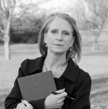 Image credit: Charles Hopkinson
For the past few years the U.S. National Design Policy Initiative has been leading discussions on the creation of a national design policy which would encourage investment in design, create national grants for design research, a dedicated senior U.S. government position for design innovation, and support for design-based solutions to climate change. What do you see as the value of a national design policy?
It’s a good initiative. Something we have lost throughout the design process is "civicness." Our designs play a civic role. Not all designs are necessarily there to make money. I think it’s one of the things that has happened with landscapes: Our public parks and landscapes are now so programmed to make money. They have become commercial ventures rather than civic foundations.
However, I don’t think there is a contradiction there between design and economic competitiveness. Some designs need to be competitive because they’re out there in the market. But I don’t think all design should be economically-driven.
New legislation on Capitol Hill would put federal funds behind urban parks and recognize their role in creating healthy communities. Representative Chaka Fattah (D-NJ) recently said, “Urban parks can no longer be separated from broader urban revitalization efforts.” What has Lurie Garden and other major urban parks Gustafson Guthrie Nichol has worked on contributed to urban communities and economies? How do you sell the environmental, economic, and social benefits to local policy makers who may not want to invest the funds needed for urban parks?
The flaw in the statement is "sell." The minute you think you have to sell something to your policy makers then you’re again entering into an economic realm. What is important about urban parks is that they are the only way to stop urban sprawl. Urban sprawl is linked with the energy crisis. Sustainability means trying to live in harmony with the planet. This isn't possible if we don’t densify our cities to stop urban sprawl. The only way to densify a city is to have urban space.
One of the reasons people move out to the suburbs is to have some sort of space, some sort of breathing room. The interior spaces of landscape in the city can replace that. They're there to enable healthy living. Urban spaces allow you to take out your children, walk your dog, or exercise. Parks provide a place to just stop and rest for a moment, stop and think about where you’re going and what you’re doing. Those are the roles of urban space in the city.
I agree with Chaka Fattah of Philadelphia that urban parks can no longer be separated from broader urban revitalization efforts. That’s absolutely correct. They are the effort -- the central core of that effort.
You recently told Dwell magazine, “Landscape is becoming more integrated into our cities and our domestic spaces.” How is landscape being integrated? Other than urban parks, which forms of landscape architecture do you see adding the most to cities?
The experience a person has the minute they leave their front door -- everything they go through, whether they’re going shopping, going to work -- is an interaction with landscape. I’ll go back to my expression, the sky is mine. For all landscape architects, anything under the open sky is a landscape architecture issue. It’s not just the urban parks, it’s the streetscapes, corners, nooks and crannies, and intermodal transportation centers. Every piece that's out there that touches people is part of the urban landscape. We are responsible for designing all of it. It’s become very important how each part of it affects the urbanscape.
The other day I was in Washington, D.C., and I loved it. There was a church with a huge staircase. People, at seven o’clock in the morning, were running up and down the steps. These monumental steps, which were first built to be part of a ceremonial access to the building, became a venue for exercise. That usage of space -- the double and triple usage of space is really our responsibility as landscape architects. If we help the city move, and improve the urban environment, we can have denser cities that function well.
Your Les Jardins de l’Imaginaire won a major award, the European Award for 20th Century Heritage. Please describe the project and how it embodies French culture.
The concept of the Les Jardins de l’Imaginaire is fragments of garden history. The goal was to take different structural elements of historical gardens, like the axis, the perspective, the plan, and translate those into contemporary form. When somebody visits a historical garden in France, or other places, they look for these compositional elements. It's the basis of the garden itself.
How does it embody French culture? It's in Terrasson-La-Villedieu, and Terrasson in French means Terre Son, which means land sound. The garden has a series of terraces that were once agricultural vine terraces, and it had natural water sources that had sound. Reusing the water and terraces throughout the project helped tie the place back into its history and the land itself.
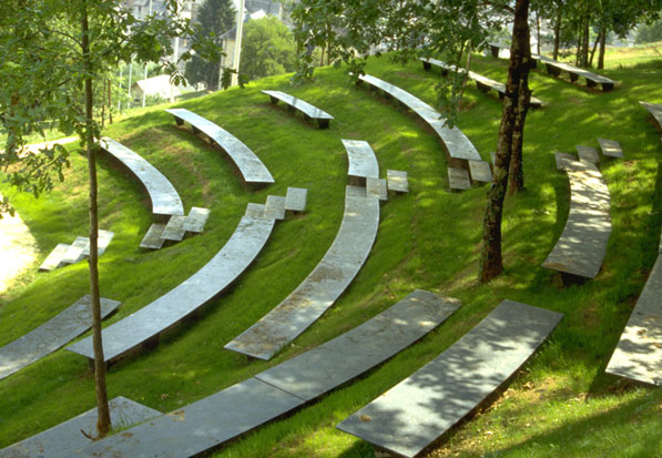 Image credit: Gustafson Guthrie Nichol Ltd
Gustafson Guthrie Nichol is designing the landscape architecture for the Smithsonian African American Museum of History and Culture expected to open on the National Mall in 2015. The project design team includes Freelon Adjaye Bond/Smith Group. How will the landscape architecture integrate the new Museum into the National Mall? How does the design reflect the Museum’s values?
The museum is located on a very charged site – adjacent to the Washington Monument, within view of the White House, Lincoln and Jefferson memorials, and adjacent to one of the principal entry routes into the city. This site is part of a much larger composition that has been evolving for over a hundred years and the landscape design for the museum will contribute to this overall composition by establishing an edge and helping to frame the open space of the Washington monument grounds.
At the same time, we will engage with the essence of the site to tell the story of the museum. In addition to the symbolic power of the location and adjacencies, there are historic elements, like the evolution of the site from a marshland to its current state, which will find expression in our design and be put in service of telling the story of African American History and Culture.
The museum seeks to make this story accessible to all and to treat it as a lens to understanding the larger common American story. In this spirit of openness and accessibility, the landscape design in conjunction with the architectural design, will also seek to present an open and welcoming presence.
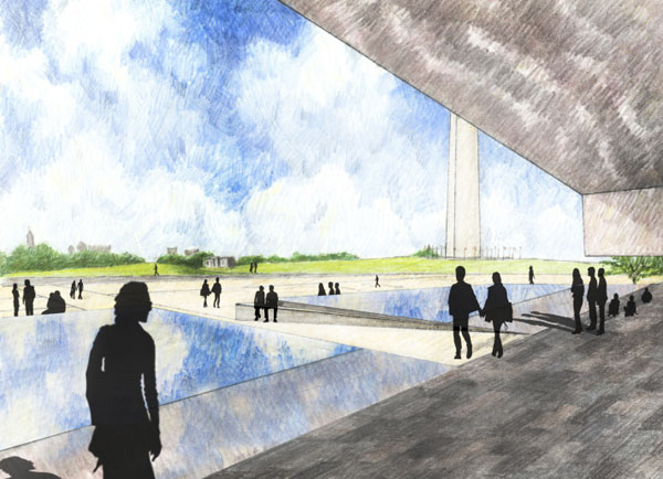 Image credit: Gustafson Guthrie Nichol Ltd
A design magazine recently called the Smithsonian American Art Museum’s Kogod Courtyard one of the "seven modern wonders of the architecture world" because of its suspended undulating roof, a feat of modern building engineering. On this project your firm worked closely with Sir Norman Foster’s firm. How did the roof and courtyard design come together? How would you describe the collaboration with Foster + Partners?
The courtyard had to be a space usable in all weather. It was an open air courtyard before the Fosters + Partner’s roof came in. We worked very closely with Foster + Partners, first, on the climate of the courtyard, to ensure the climate was adaptable not only for humans but also for plants. We did a lot of research to create the feel of the courtyard. The Smithsonian did want to have an event space, a type of ballroom that could seat 1,000 people. We had to create a space that could take that many people when full, but when there was not an event, could still exist in its own right.
We looked very carefully at the era the building was built. The Patent Office Building (the original name of the building) is one of America’s most important examples of Greek Revival. It was built between 1830 and 1860 and it’s very important historically. We looked into Greek Revival to determine what would be appropriate for the building itself, understanding you’re now in a very modern courtyard, but with echoes of history. We did not want to create a Mediterranean or tropical feeling because it was a temperate courtyard before.
Dan Hinkley, a plants expert, joined our team to formulate a pallet of plants that echoed the temperate courtyard of the recent past. To do that, we worked very closely with Foster + Partners to ensure there was an appropriate amount of light for both human being and plants. At the same time, we also worked with caterers to make sure we had the right movement, the right function to have large events. Event workers could not disrupt the functionality of the museum, which is very important.
One of the major features in the courtyard is a scrim -- a very shallow water feature which is only about a quarter inch deep. There are four of them that connect the space over the entire length. The scrims can be turned off one at a time. One can be left on, which allows you to have an animation of the space during very quiet hours. All of them can be turned off if you want a very large event.
The water works with Foster + Partner's design and celebrates the roof. One of the things the scrim does is serve as a perfect mirror. It reflects not only the contemporary architecture of the roof in the floor but also the historical architecture of the north wall, which is one of the most beautiful walls in the space. You get a combination of both images within the landscape at the same time. That creates a texture that is very important.
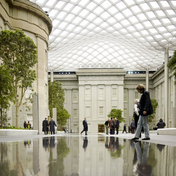 Image credit: Foster + Partners
I think the last thing to say about the courtyard that’s very important is the lighting. George Sexton, a Washington, D.C. lighting designer, worked very closely with us to really create lighting that was very ambient, soft, and magical, very much like a temperate piece. The lighting can become a very theatrical piece with different colors and different lights. It's very adaptive to events and moods.
The Kogod courtyard and the Promenade at McCaw Hall in Seattle both feature those thin sheets of water you just mentioned rolling over the stone floors. Do you consider this to be one of your firm’s signature design elements?
The very first scrim was designed for the American Museum of Natural History in New York City in 1997, and completed in 2009. It has become a very important feature in our work. I think they are magical because they are so adaptable. They give you the sound of water, the movement and reflection of water, and at the same time they’re safe.
They are really only for spaces where you want to have events once in a while, but you’re not going to have events all the time. They’re good for spaces where you don't really want a lot of splash or water jets. You get the best of water in a low-usage realm. They’re very economical in that they give you a lot of effect for very little water.
I like them because they’re quiet and there’s not a lot of hoopla. They are more reflective, serene in character.
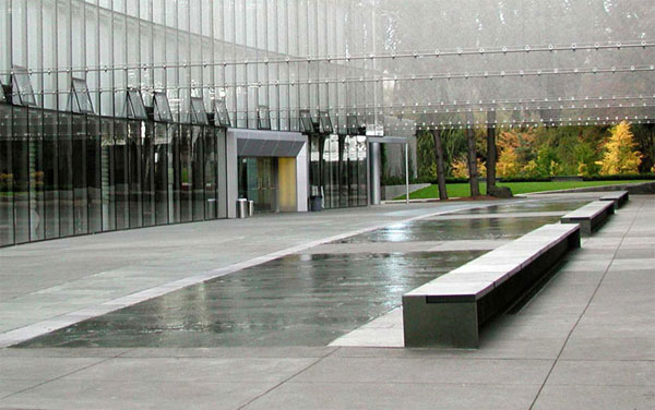 Image credit: Gustafson Guthrie Nichol Ltd
Kathryn Gustafson, ASLA, is principal at Gustafson Guthrie Nichol. Gustafson is an honorary fellow of the Royal Institute of British Architecture, an honorary Royal Designer for Industry, and a medalist of the French Academy of Architecture. She is the recipient of The Chrysler Design Award and London’s Jane Drew Prize.
Interview conducted by Jared Green.