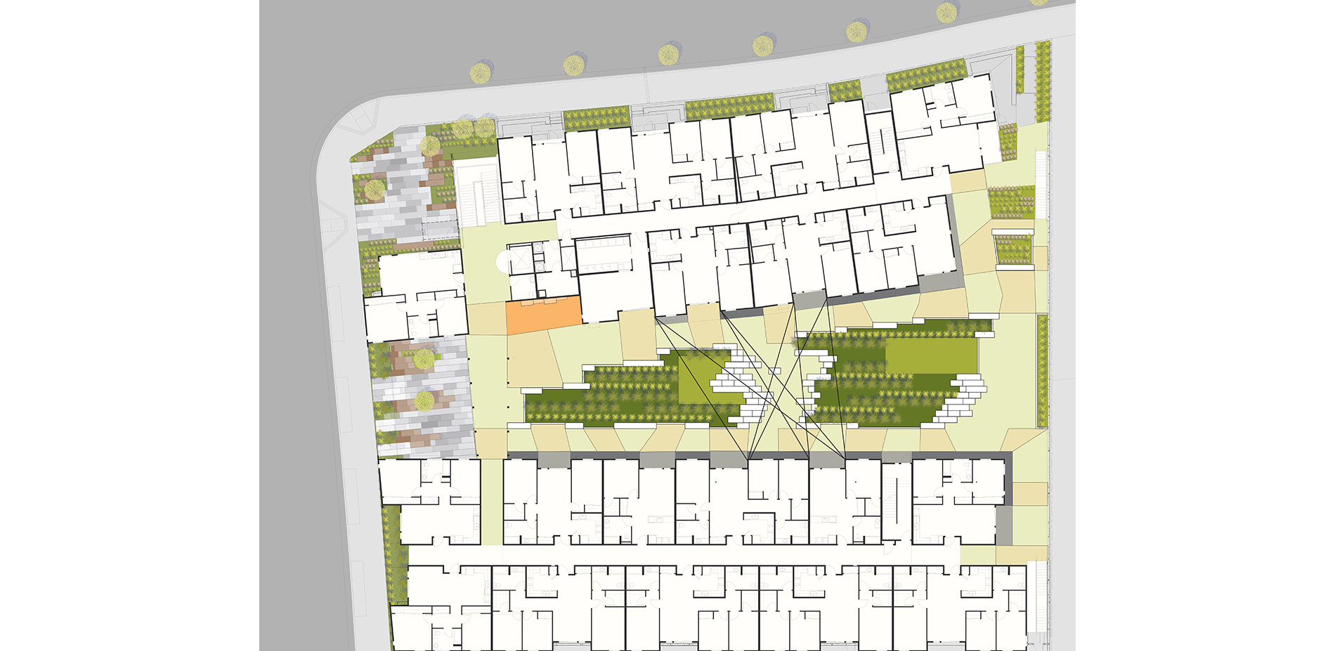
ILLUSTRATIVE SITE PLAN:
The site design is inspired by the geology of the Sierra foothills and also by the video game Tempest. The entire project is divided into a linear two-foot grid oriented on the east-west axis. Landscape features shift along this grid, creating spaces for living. The landscape scope of work includes the streetscape, two public plazas, a central Court, an urban agricultural area, and a secret garden.
Photo Credit: Mariko Reed
Media: Please submit high-resolution image requests to images@asla.org.
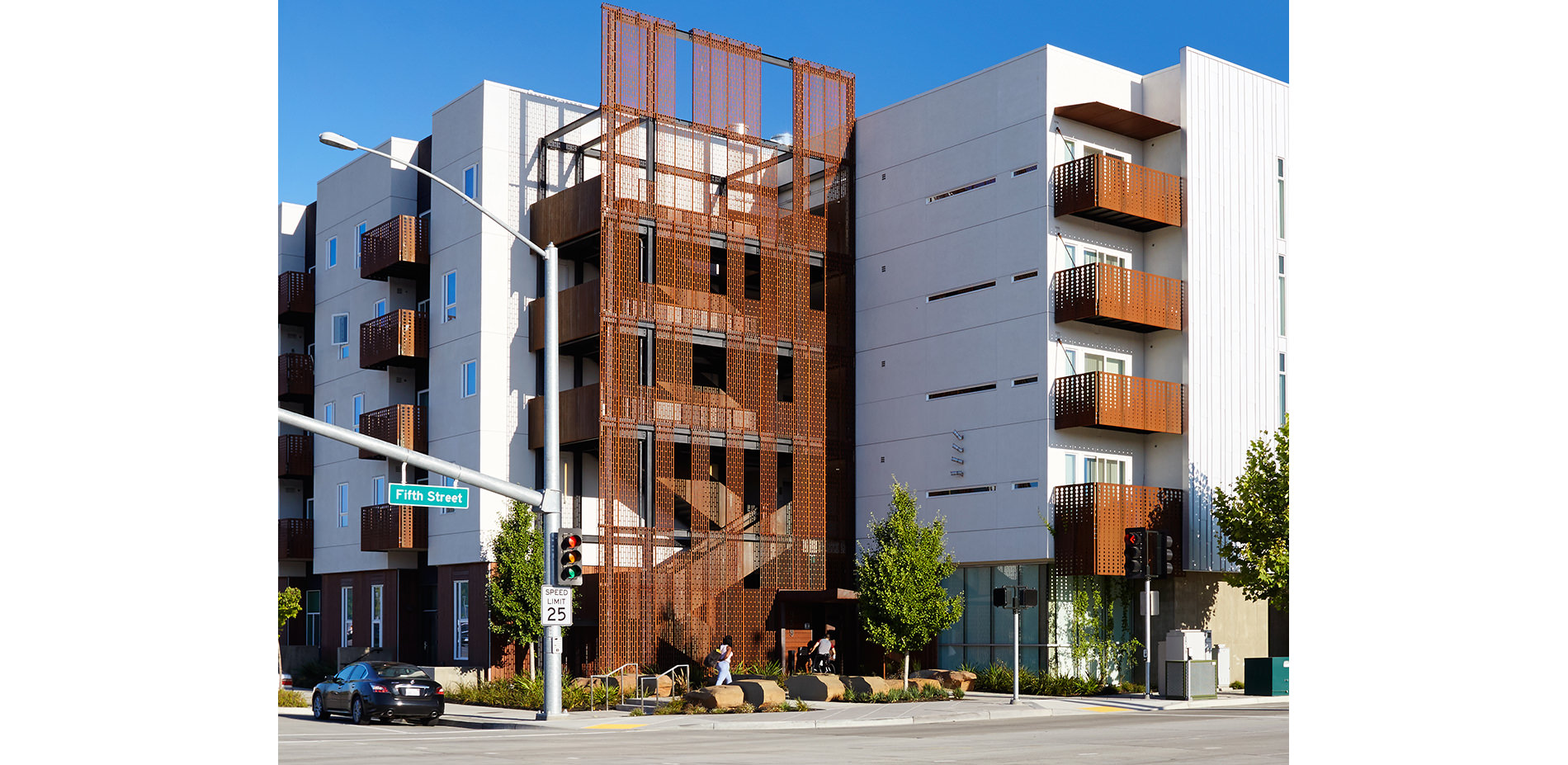
STREETSCAPE:
Drought tolerant plantings and street trees create a pedestrian scale sidewalk and set a standard for future development within the community. Mature Sycamore trees, which grow naturally along the adjacent Sacramento River, are planted both in the sidewalk and in stormwater chicanes within the street.
Photo Credit: Mariko Reed
Media: Please submit high-resolution image requests to images@asla.org.
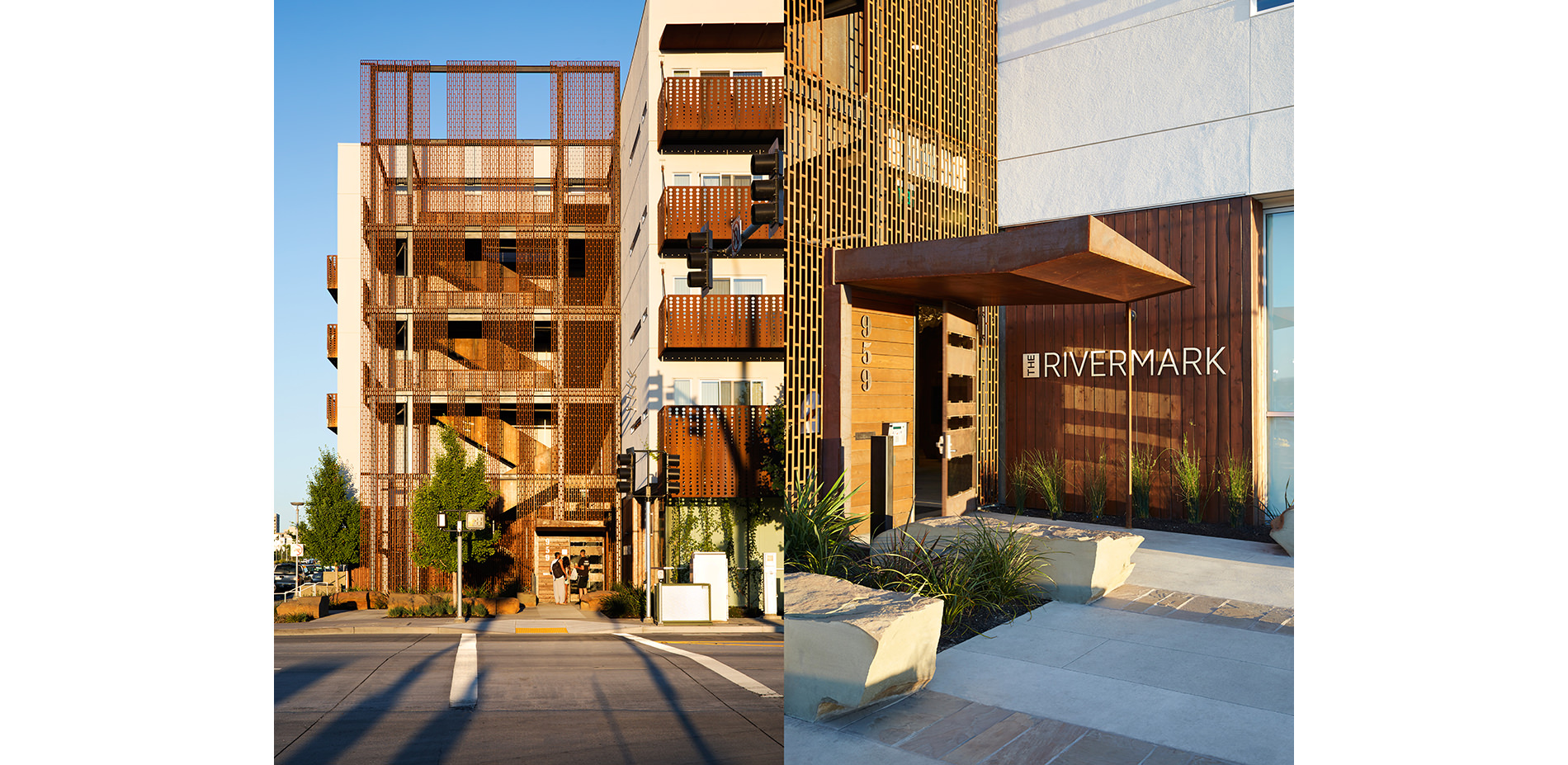
THE ENTRY PLAZA:
Left: Inspired by the geology of the Sierra foothills and the Sacramento region, the shifting pattern of the local boulders relates to the region’s tectonic activity. A small grove of Ginkgo trees offers shade and enclosure. Right: The shifting boulders also double as street furniture, offering the public places to relax.
Photo Credit: Mariko Reed
Media: Please submit high-resolution image requests to images@asla.org.
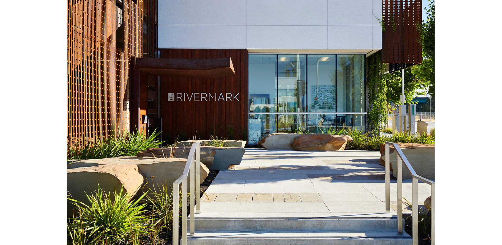
THE ENTRY PLAZA:
Off-cuts from the boulders were honed and used as paving inlays to accent and extend the boulders into the space. These gestures are meant to be tracks, as if the boulders have been blown by the wind, or suggesting some mysterious dynamic.
Photo Credit: Mariko Reed
Media: Please submit high-resolution image requests to images@asla.org.
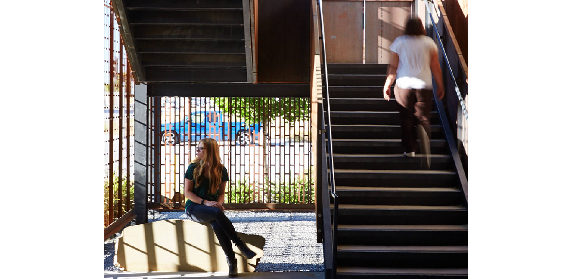
THE VESTIBULE:
The entire building has open hallways. If you are not in your unit, you are always outside. The boulders migrate through the light, corten steel perimeter into the common areas. Local riverrocks are inlaid into the paving beyond.
Photo Credit: Mariko Reed
Media: Please submit high-resolution image requests to images@asla.org.
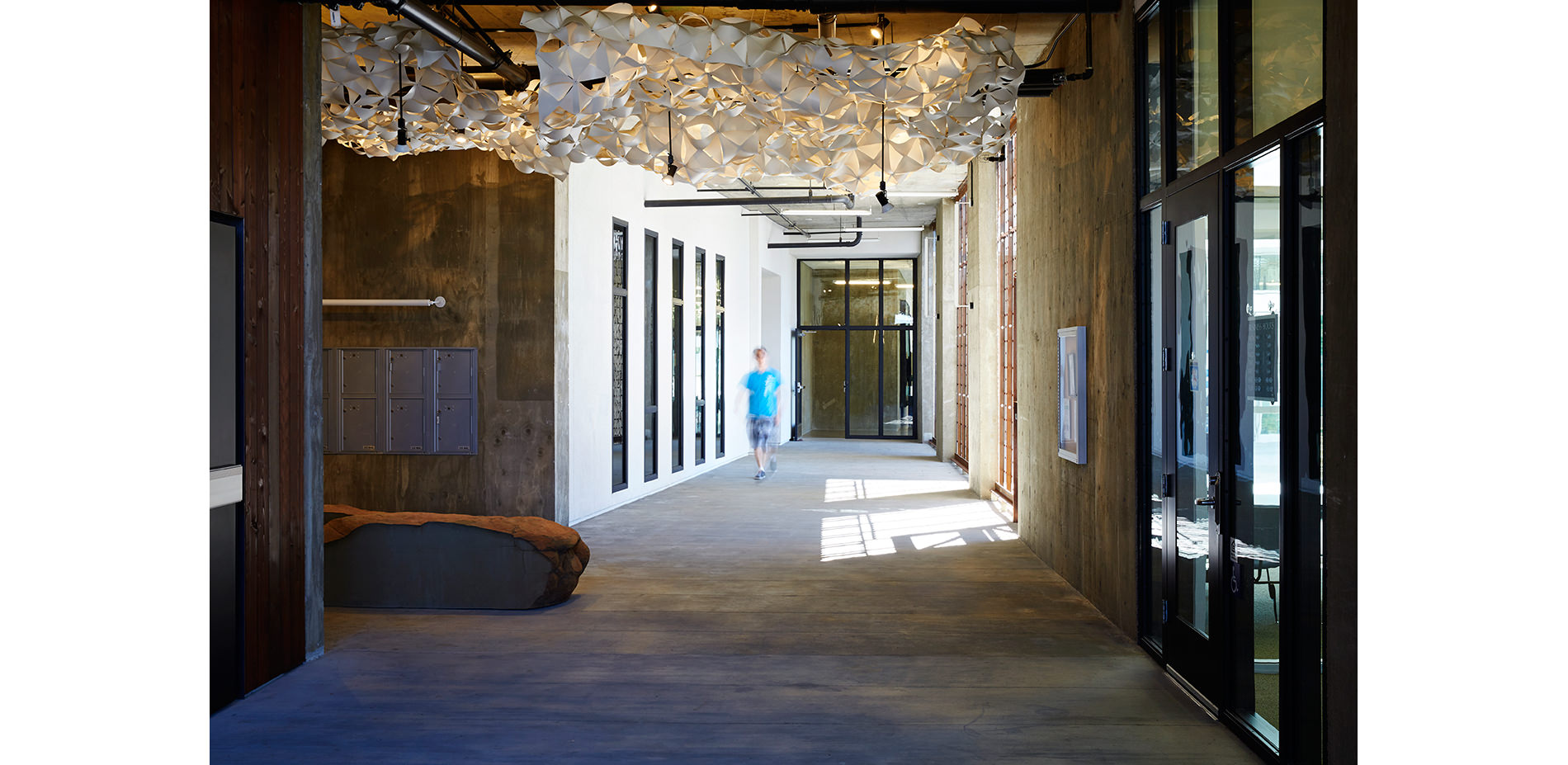
THE CLOUD:
Within the building. “The Cloud” is a custom sculpture suspended from the ceiling of the central lobby. The landscape architects worked with a local artist, developed the parametric scripting, fabrication, and installed the project.
Photo Credit: Mariko Reed
Media: Please submit high-resolution image requests to images@asla.org.
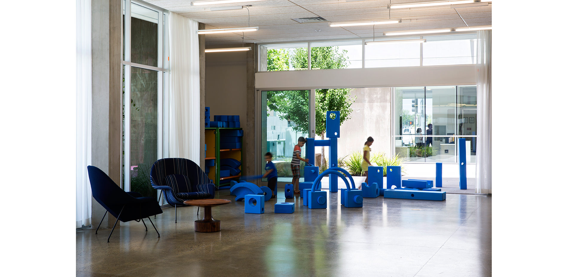
THE MIDDLE PLAZA:
This plaza serves as a public extension of the community room. Large doors open out into a simple space that is adjacent to the public sidewalk.
Photo Credit: Mariko Reed
Media: Please submit high-resolution image requests to images@asla.org.
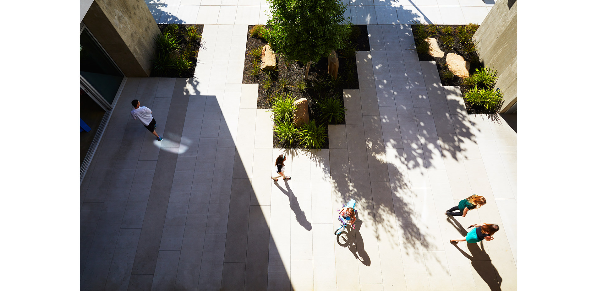
THE MIDDLE PLAZA FROM ABOVE:
The space is intended to provide much needed open play, and tricycle space for young growing bodies to explore.
Photo Credit: Mariko Reed
Media: Please submit high-resolution image requests to images@asla.org.
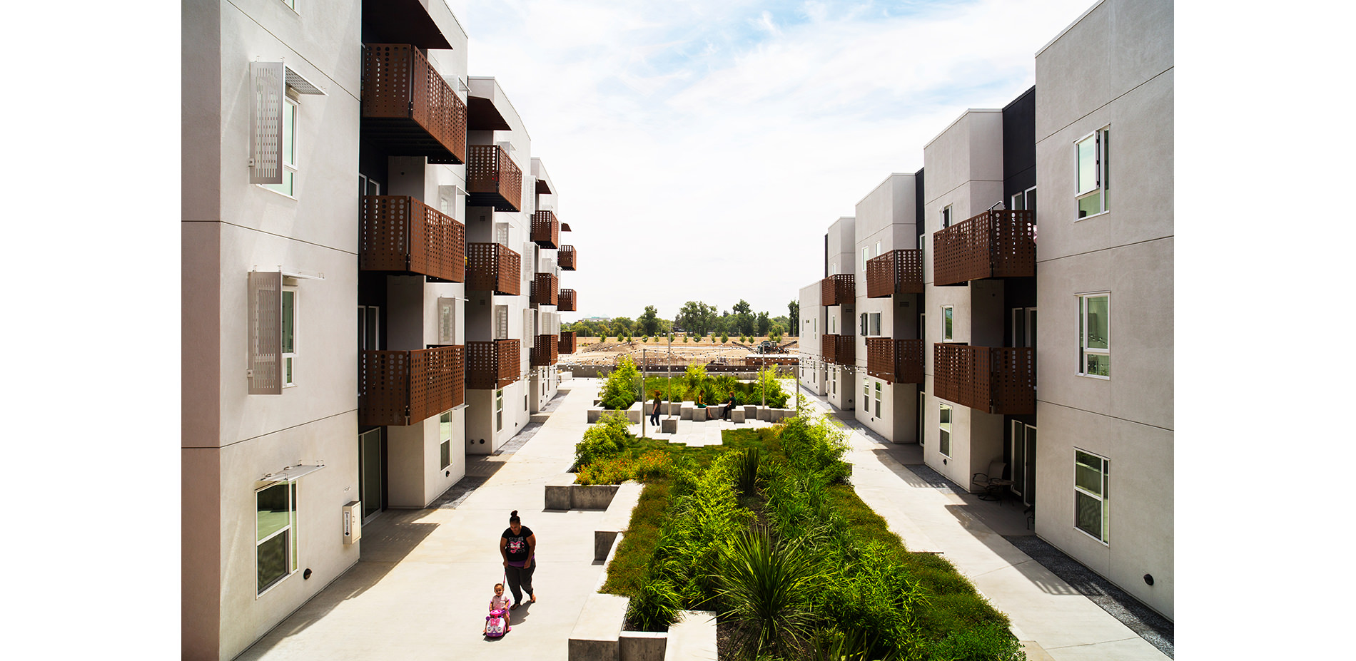
THE CENTRAL COURT:
The Central Court includes two meadows, garden plots (at the rear), a climbing wall and three plazas. The plantings at the podium reference the diverse agriculture surrounding the site and are arranged in rows on a strict axis. Balconies, decks, and patios surround the Court, creating a continuum of private to public space.
Photo Credit: Mariko Reed
Media: Please submit high-resolution image requests to images@asla.org.
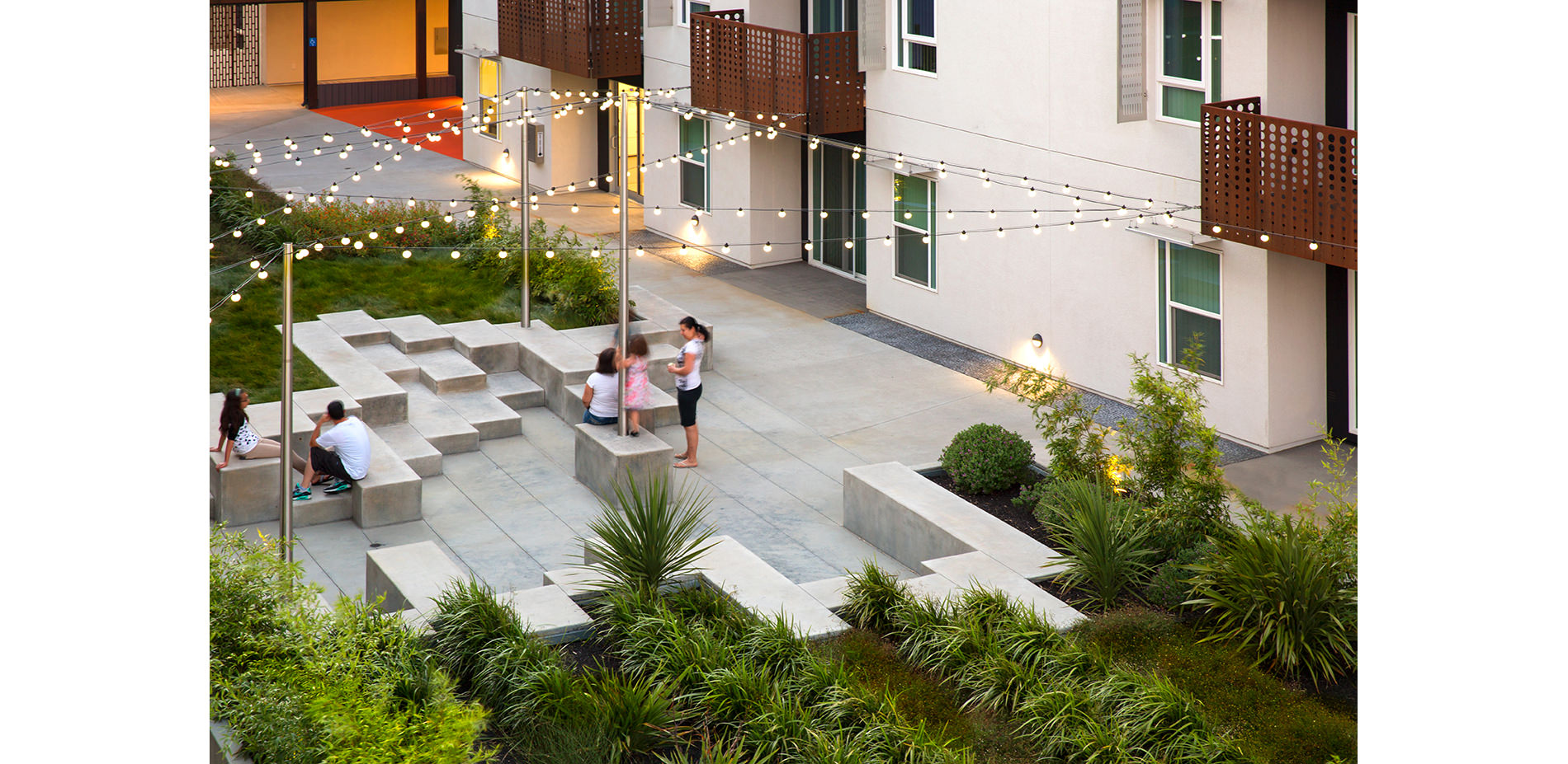
THE CENTRAL COURT:
The central court is designed as a series of urban tidepools arranged along a varied geometric topography of custom concrete benches and dramatic plantings. The structures can accommodate formal amphitheater seating as well as casual and unstructured play.
Photo Credit: Mariko Reed
Media: Please submit high-resolution image requests to images@asla.org.
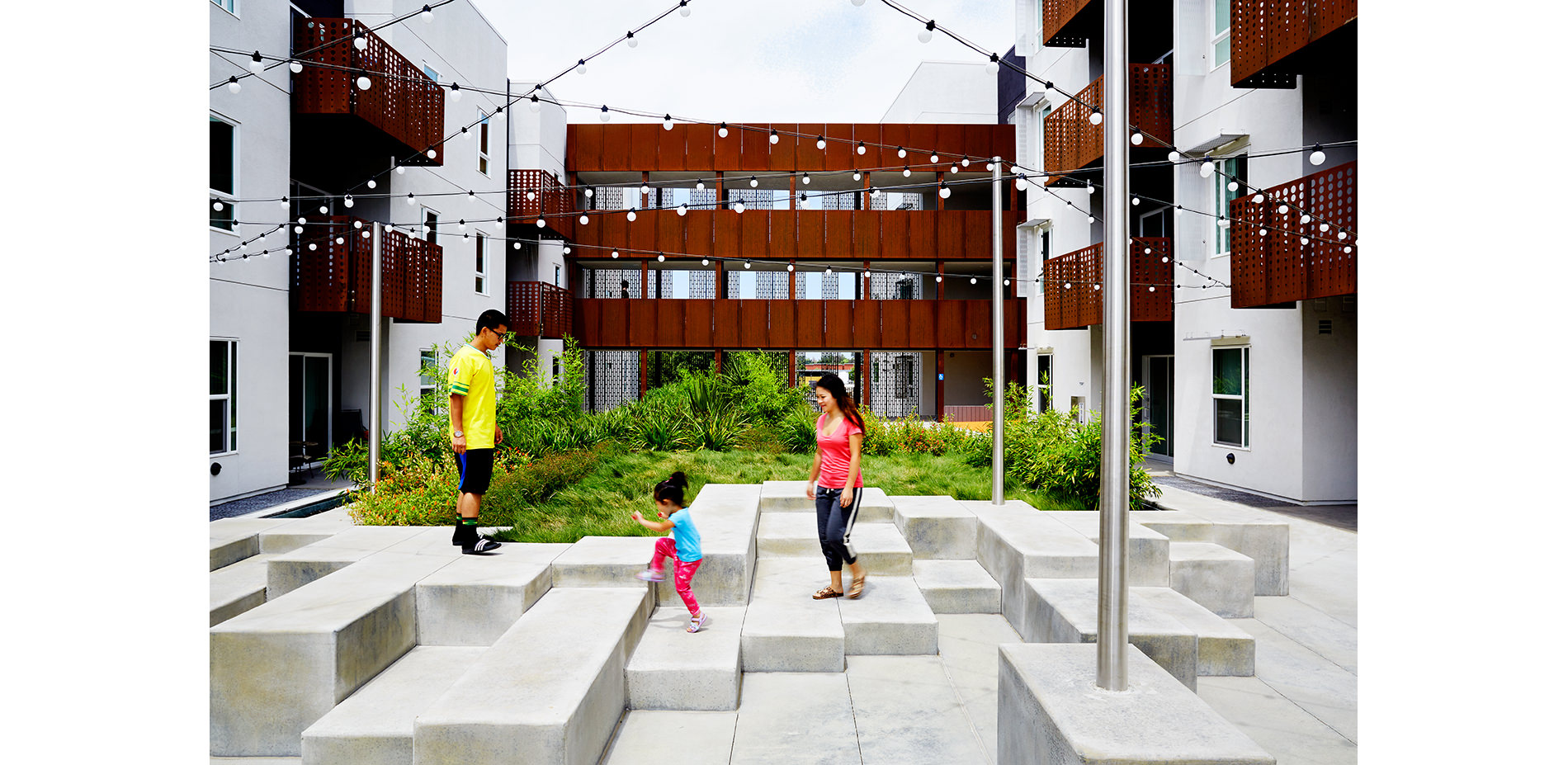
THE CENTRAL COURT:
Children and families play in the tidepool, and also have informal gatherings in the two meadows.
Photo Credit: Mariko Reed
Media: Please submit high-resolution image requests to images@asla.org.
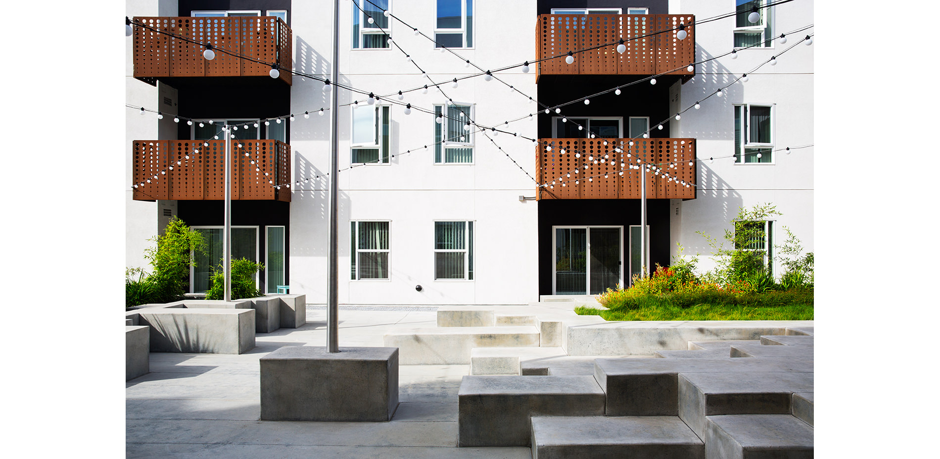
THE CENTRAL COURT:
Tapered steel light poles connect this public space to the building balconies, and bring the stars down to the space at night.
Photo Credit: Mariko Reed
Media: Please submit high-resolution image requests to images@asla.org.
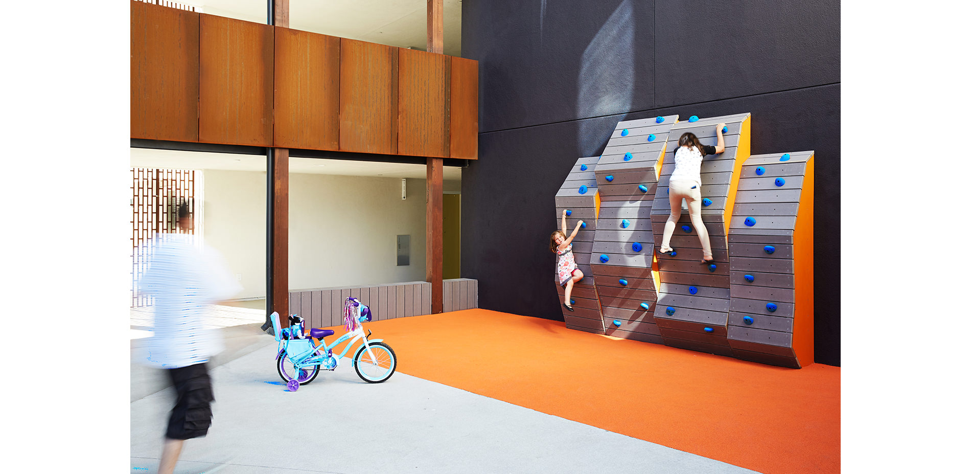
THE CLIMBING WALL:
The spatial limitations of the play area inspired the designers to build up instead of out. The climbing wall draws topographic inspiration from the iconic cover of the Joy Division album Unknown Pleasures, overlaid with a color scheme that references Howard Johnson motels.
Photo Credit: Mariko Reed
Media: Please submit high-resolution image requests to images@asla.org.
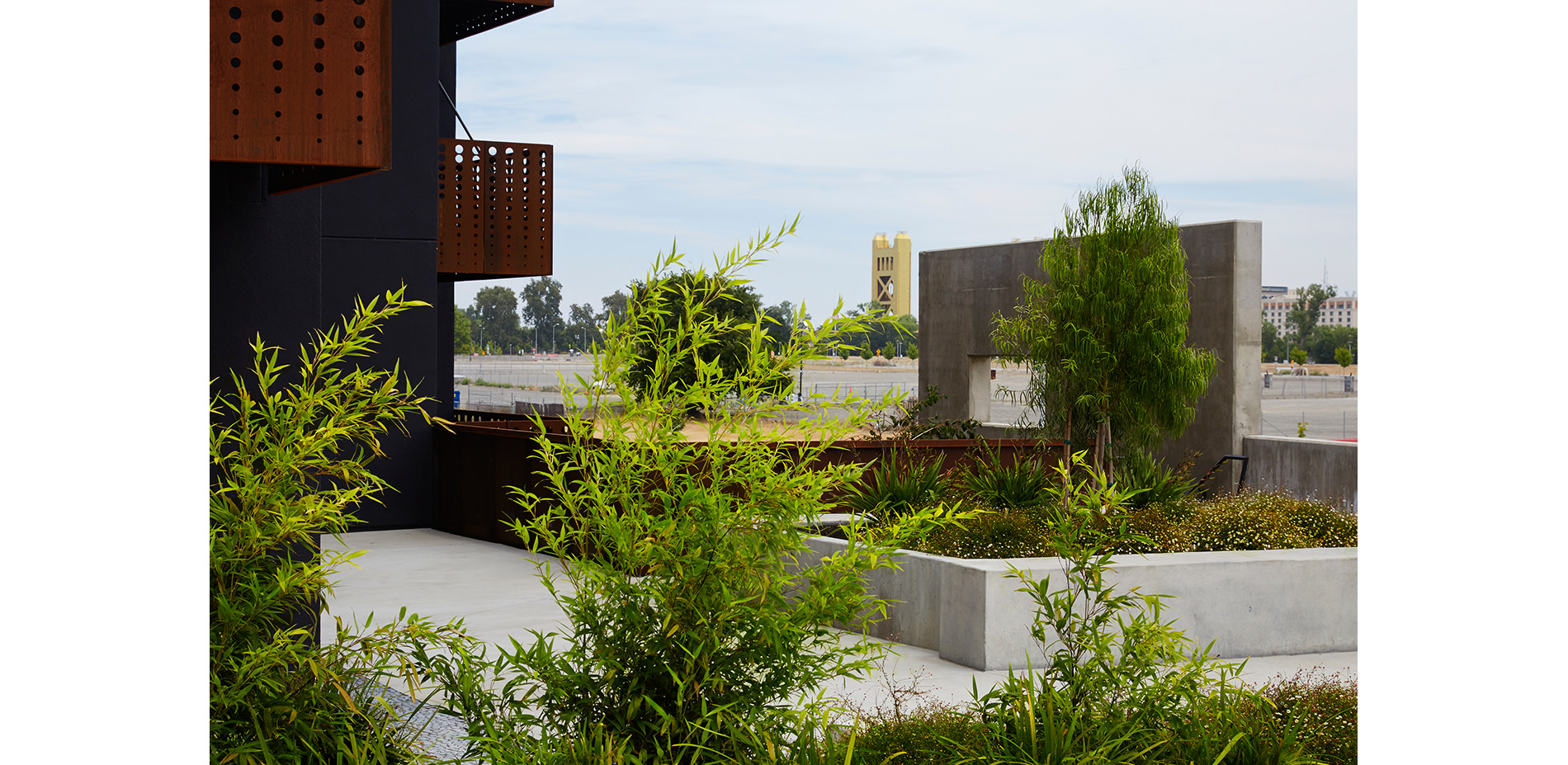
THE CENTRAL COURT:
Custom perforated screens open out to the neighborhood beyond. Open air hallways further this sense of permeability and blur the boundary between interior and exterior space. The parapet wall extend upward to from a distant view, and to respond to the iconic Tower Bridge.
Photo Credit: Mariko Reed
Media: Please submit high-resolution image requests to images@asla.org.
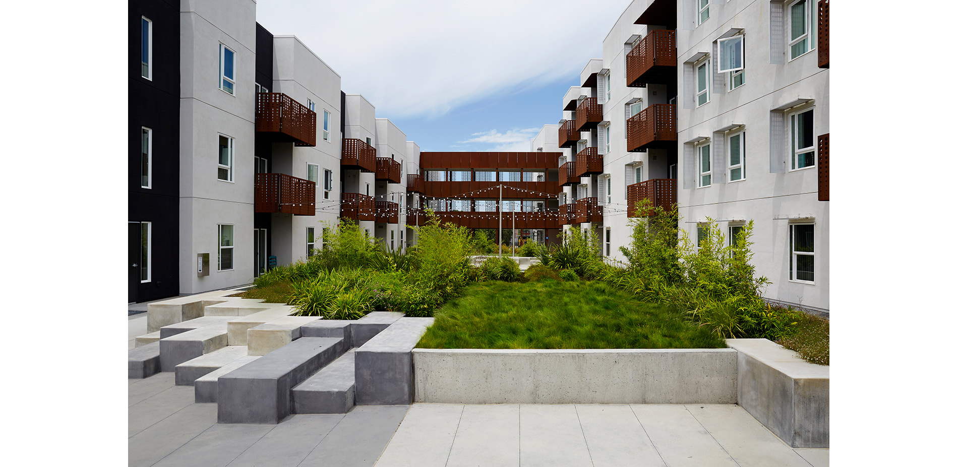
THE CENTRAL COURT:
One of two small meadows offer a soft place to rest and to play. The form and varying heights of the concrete walls was further developed with the parametric program Grasshopper.
Photo Credit: Mariko Reed
Media: Please submit high-resolution image requests to images@asla.org.


