«previous pageRESIDENTIAL DESIGN CATEGORY
Project Statement
How do architecture and landscape connect with one another?
The project's architecture is a sleek, rational mid-century modern residence. It celebrates a connection with the car. It espouses the idea of modernity as lifestyle.
With an open, airy quality, it rests on the ground lightly. Here modernity presents an opportunity for landscape to be an opposing quality — an earthy, grounded counterbalance.
From this dynamic relationship, the clients' perspective on lifestyle is expanded.
Project Narrative
Location, Size and Site
The Hilltop Residence, a 15 minute drive from downtown Seattle, Washington, sits in a one acre parcel, in a noted early example of a modern planned community. Published in several journals, including Progressive Architecture and Architectural Record, the Hilltop Community was initially planned between 1947 and 1950. Sited to create privacy at the entry and to maximize a connection to the mountain view from its main living spaces, the house is a superb example of this 'siting and design' approach.
Natural Context
The Pacific Northwest features a mild oceanic climate. Winters are wet and mild (av. temp. 38 ) with summers mild to warm and relatively dry (av. temp. 65 ). Rainfall averages 39 inches per year. Soils are mostly alluvial from glacial action. Relatively infertile, the glacial till consists of rock fragments from small pebbles to large boulders. The flora native to the Puget Sound region includes Western Hemlock, Western Red Cedar, Red Alder, Douglas Fir, Madrone and their associated shrubs and understory plants.
Human/Social Context
The founding members of the Hilltop Community were all interested in modern planning and architecture. Designed by architect John Detlie (1908-2005) in 1950, the Hilltop Residence is archetypical of mid-century modern residential architecture — radical and rational, unornamented, lightweight in construction with open-plan flowing volumes.
Design Overview
Facilitating privacy at the entry and maximizing mountain views from the living spaces, the slope of the shed roof is lowest at the carport and expands to create the tallest ceiling heights at the view windows. Thus, with sensitive siting, the house appears modest in size but in actuality is considerably larger because the ground studio is tucked beneath this level. (See Section Detail)
Design Program and Intent
Q: WHAT WAS THE CHALLENGE?
A: To engage the landscape and architecture in a thoughtful, more intentional dialogue. Hardscape and landscape lacked coherency. An under-scaled terrace did not read as an extension of adjacent interior space. A single narrow path to the entrance connected the car user with the house but ignored the person on foot. Plantings appeared ad hoc and 'Gardenesque' in style.
Q: WHAT WAS THE APPROACH?
A: The landscape was treated as an opposing quality to the architecture. Nature as an earthy, grounded counterbalance to the sleek lightness of the built form. Two moods were emphasized: the shady introspection of the entry, and the sunlit expansiveness of the social view area.
Q: HOW WAS THIS ACCOMPLISED?
A: By focusing on the margin between the built and the un-built, man-made and 'natural'. By juxtaposing the two, a dynamic relationship was encouraged. Taking design cues from how the architecture responds to the mature Douglas Fir (they are engaged), then led to an exploration of the ground plane — the 'forest floor' at its feet. Here the design attempts to be a study on this relationship.
Q: HOW DID THIS MEET THE CHALLENGE?
A: 'Modernity' (in all of its forms) is in danger of losing its connection with 'nature'. The Hilltop Residence, with a seamless link between car, structure, and to the living spaces within, embraces modernity as lifestyle. Here the designed landscape seeks to redress any deficiency by connecting the visitor and homeowner to the interplay between man-made and 'natural', thus expanding their perspective on lifestyle.
Project Resources
Landscape Designer
Paul R. Broadhurst
Lead Designer
Paul R. Broadhurst
Stone Mason and Hard
Surface Contractor
Mike Scharnberg, Sculptor
Richard Hesterkind
Installation
Green Architecture
Featured Products
Furniture
Brown Jordan 'Meridian'
Daybed Fabric
Donghia
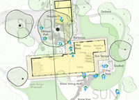
Site Plan

[1] With seamless ease and efficiency car and house are connected. Here at the entry, the structure has a recessive quality. The low-slung shed roof is anchored by the Doug Fir and the residence screened by Vine Maples creating privacy. (Photo: Steve Dubinsky)

[2] Bark, fern, rock and paving linked together near the car door at the carport. The closeness of tree to architecture, its coarse trunk emerging from the ground plane, was the clue to a relationship then developed throughout the project. (Photo: Steve Dubinsky)
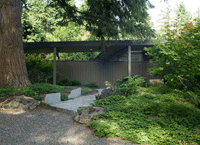
[3] By cutting apart and creating an opening, a path for the visitor on foot became an opportunity to explore ground plane still further. (Photo: Steve Dubinsky)
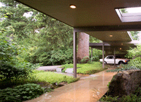
[4] By design, the lightweight canopy and carport acknowledges the trunk of the Doug Fir and with it, its grounding presence. In this shady introverted space, with intimate sightlines, lush panels of ground covers mimic the native forest floor. (Photo: Steve Dubinsky)

[5] Of boulders and bronze. Dissecting materials with surgical precision, the Oblique Path creates a visceral connection with the surface. The cut and honed granite boulders and bronze 'razor edges' hold back and disrupt the flow of ground covers. (Photo: Steve Dubinsky)

[6] Plush growth of moss and liverworts are sustained by the slow flow of water at the Wet Rock. As the tree connects 'nature' to the carport, so the Wet Rock creates an engagement with 'nature' at the residence's entry. (Photo: Steve Dubinsky)

[7] At the house, the path bridges the Wet Rock and pool. Plant life luxuriates by the wet 'seep'. A deep return to the paving edge imparts weight. A pocket view through the house leads the eye to mountain views. (Photo: Steve Dubinsky)
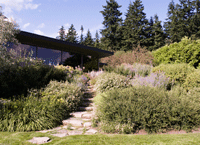
[8] Out in the open. From its origin at the carport, the pitch of the shed roof grows, facilitating expansive sightlines to mountain views from the living spaces. A granite path connects the lower level to the house and Sun Terrace. (Photo: Steve Dubinsky)
"The real deal with little inventive surprises and moves. We love the scale and relationship of modern forms. It could win for best planting design if we gave an award for that. It makes you want to be there."
— 2009 Professional Awards Jury

[9] In strong contrast to the shaded plantings at the entry, sun-loving aromatics lap up against the stone sitting wall at the top step of the granite path. The Sun Terrace is visible beyond. (Photo: Steve Dubinsky)
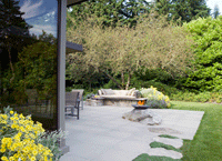
[10] Materials mingle on the Sun Terrace. Here extensive window walls open directly to the terrace. With streamlined efficiency, external spaces can mirror the internal spaces within. (Photo: Steve Dubinsky)
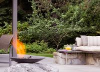
[11] A terrace with a certain swing. With a reference to ease of living, the Day Bed and the Fire Rock sound a 'cool' note to this reinterpreted take on '50's modern'. (Photo: Steve Dubinsky)
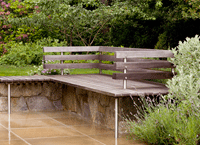
[12] A lively interplay of concrete paving, granite, stainless steel, hardwood and plantings come together on the Sun Terrace to form the Day Bed. Built to withstand all seasons, in the summer Donghia exterior fabric cushions add plushness. (Photo: Steve Dubinsky)
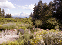
[13] Asleep, not extinct, a dormant volcano can add to any project. With Mount Rainier for eye-popping context, native and non-native plants were massed for an easy harmony, durability and extended interest. (Photo: Steve Dubinsky)

[14] Living with a mid-century modern. Window walls expand to celebrate views both from the inside to out, but here at sunset, to within. On a summer's evening a 'camp fire' experience is made possible in front of the volcano. (Photo: Steve Dubinsky)
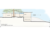
[15] Section Detail


