«previous pageGENERAL DESIGN CATEGORY
Honor Award
The Museum of Modern Art Roof Garden, New York, NY
Ken Smith Landscape Architect, New York, NY
client: The Museum of Modern Art
Project Statement:
The new roof garden on top of the Taniguchi building at the Museum of Modern Art in New York marks a contemporary addition to the landscape spaces at the museum, which also include the modern sculpture garden designed by Philip Johnson and Zion and Breen in 1953. The garden breaks new ground esthetically in terms of design vocabulary, wit and irony, materiality and public visibility. While physically inaccessible the garden is highly visible as a viewing garden at the urban high-rise scale of Midtown Manhattan.
Project Narrative:
Project Background and Program
The new Museum of Modern Art in New York City is a unified complex of existing and new structures. Construction of the new museum involved impacts on the neighboring Museum Tower residential condominium and as mitigation the museum agreed to construct a decorative rooftop on the new roof areas over the new sixth floor galleries. The roof areas, while not visible or accessible to the museum visitor, function as an urban viewing garden for the neighboring Midtown high-rise community. The original 1939 museum building also had a rooftop design element that could be read only from above and this tradition was continued at the temporary MoMA Queens, which had roof graphics visible from the elevated subway. The project architects, Yoshio Taniguchi, and Kohn Pederson Fox had designated a simple pattern of black and white gravel stripes that was part of the buildings base construction budget. MoMAs director and curators, however, wanted a design that functioned as both viewing garden and art installation. In addition to a relatively modest construction budget, the landscape design commission came with a set of limitations imposed by the client. The roof structure and waterproofing membrane had already been constructed. The surface had been designed with a landscape live load of only twenty-five pounds per square foot; there were to be no structural attachments to the roof or penetrations to the buildings waterproof membrane; the garden was to be designed for a program requiring minimal maintenance and no irrigation; and use of living plant materials was discouraged. Because the museum had already purchased the black and white gravel the design was encouraged to incorporate those materials as well.
Design Concepts
The notion of simulated nature and the simulation strategies and theories of camouflage were used to generate the roof garden forms. The design team did a periodical literature search of camouflage articles in architecture and design journals from the late 1930’s and early 1940’s. Camouflage was a popular topic in such publications as Art News, 1932; Architecture Record 1917 and 1939; Builder Magazine, 1939; Architect and Engineer Magazine, 1942; Architectural Forum, 1942; Pencil Points, 1942; and The Architectural Review 1944.
“Camouflage is functional design par excellence. Its only raison d’etre is to conceal effectively.&mbsp; Whether this is done with aesthetically valuable or indifferent results, cannot matter in the least to those who commission it and pay for it. Yet — as it is mostly done by artists or at least experts of aesthetic sensibility — the results of camouflage often have a distinct visual charm and curious similarity to the conscious creations of modern art.”
The Architectural Review, Sept. 1944
In contemporary art theory, simulation has been a topic of considerable interest in the theoretical writings of Jean Baudrillard, Simulacra and Simulations, 1981, and in other theorists contributing to a growing body of simulation-related work in the art world.
Camouflage is the art of masking or disguise. Specialists refer to it as “disruptive pattern.” In military practice, buildings or infrastructure are camouflaged to blend into their surroundings. Architect and Engineer Magazine in 1942 identified and described four basic strategies of military and civilian camouflage: “The problems are many and varied. Almost always the camoufleur is called in after the site has been selected and the building built. It is up to him to do something with it. I grant that this is not good planning, but the reasoning seems to be this: Let’s get under way as soon as possible and plan our building for maximum efficiency, if we have to camouflage we can do it later . . .
The four major methods of camouflage are: 1. imitation, 2. deception, 3. decoy, 4. confusion. The landscape architect used these four strategies to develop the initial design alternatives for the roof garden. The alternate design studies were presented and discussed with the client along with representatives of the neighboring residential tower. The "deception" scheme was selected.
The history of landscape design is filled with examples of camouflage and simulation. Central Park, for example, is a large-scale garden that artistically simulates visual and spatial aspects of an idealized pre-industrial arcadia and disguises a large territory of the Manhattan grid with a simulated nature. Contemporary landscape design often deals with the fundamental issue of ameliorating or covering up the impacts of the constructed environments. Practitioners refer to it as “remediation,” “shrubbing it up,” “contextualization,” or simply “naturalizing.” This practice of landscaping as camouflage is a common but critically unrecognized aspect of simulation in the landscape architecture profession. In contemporary urban life camouflage is ironically used to both blend in and stand out. This project takes the art of camouflage and the artifice of simulation a step further by using the simulation of camouflage itself as a source for design speculation. One might think of this as the simulation of a simulation or using imitated nature to generate a new nature.
Construction and Fabrication
The design also draws inspiration from Japanese dry Zen gardens with a relatively flat garden of white gravel, recycled black rubber, crushed glass, sculptural stones and artificial boxwood plants. Tan headers fabricated from milled foam and coated with a hardening surface define areas of material and give a crisp definition to the design layout. While rooted in tradition, the design and fabrication is contemporary in spirit and form.
The design started out most literally as a Xerox copy taken from a pair of skateboarder’s camouflage pants. The pattern was scaled and fitted onto the roof area. The design was translated through the rigor of a reductive geometry of straight line segments, three distinct curve radii, and two intersection conditions. Extensive research was done on materials, material systems and fabrication techniques. The MoMA roof garden material palette consists of natural, recycled and synthetic materials including natural crushed stone, recycled glass, recycled rubber mulch, as well as synthetic materials including fiberglass grating, PVC fittings, artificial boxwood plants, foam headers and artificial rocks. Contemporary C-N-C (computer-numerical-cutting) fabrication techniques were used to reduce on-site labor. All of the fiberglass panels and foam headers were factory-cut, using the landscape architect’s CAD files as templates.
Project Resources
Landscape Architect
Ken Smith Landscape Architect
Client
Glenn D. Lowry, Director, The Museum of Modern Art
Landscape Contractor
Town and Gardens, Ltd
Featured Products
Recycled Glass Aggregate and Rubber Mulch
Playsafe Surfacing Inc.
Curvilinear Foam Headers
FSI Products
Synthetic Rocks
Dekorra Products LLC
Artificial Boxwoods
Earthflora Inc.
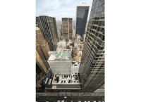
View from top of 40 W 53rd Street (Photo: Peter Mauss/ESTO)
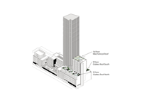
Axonometric View (Photo: Ken Smith Landscape Architect)
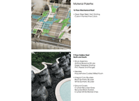
Material Palette (Peter Mauss/ESTO)
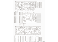
Construction Document, Layout Plans (Photo: Ken Smith Landscape Architect)
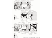
Construction Document, Material Plans (Photo: Ken Smith Landscape Architect)

View from top of 40 W 53rd Street (Photo: Peter Mauss/ESTO)
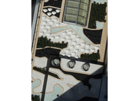
View from Museum Tower, 40 W 53rd Street (Photo: Peter Mauss/ESTO)
"Original--a real garden in a form that hasn't been seen before. It's amazingly contextual--the artificial elements really work in this setting. We love the painted grates. Graphic design at a city scale. "
— 2009 Professional Awards Jury
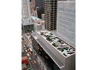
View from Warwick Hoel, Sixth Avenue and 54th Street (Photo: Peter Mauss/ESTO)
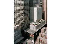
View from Peninsula Hotel, Fifth Avenue and 55th Street (Photo: Peter Mauss/ESTO)
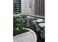
View of South Roof detail (Photo: Peter Mauss/ESTO)
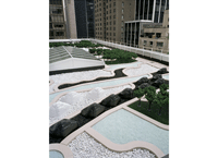
View of North Roof detail (Photo: Peter Mauss/ESTO)
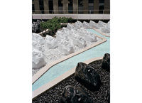
Close-up View of South Roof detail (Photo: Peter Mauss/ESTO)
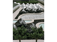
Close-up View of South Roof detail (Photo: Peter Mauss/ESTO)


